Friday, May 4, 2012

road map ii


               Jaelynn; Sado Island, Japan 2009         Jaelynn; Sado Island, Japan 2009

Road Map {Prediction}:
- adjust levels {bring out the background}
- adjust curves {make sure not to let her dissolve into the background}
- crop or edit out the foot

Road Map {Actual}:
- cropped out foot on right
- adjusted levels {brought out the background}
- adjusted curves {separated her from the background}
- adjusted brightness
- lasso'd and created a new layer for the background
- adjusted background layers
- had to go back in and try to blend/blur/heal her outline {the most obvious screw up is her left hand -__- } and then i had to go back in and painstakingly paint back in the colors of the background to help blend it better. i have learned i hate the healing tools.
- lasso'd and created a new layer for her obi {sash/tie}
- adjusted the levels on the obi to bring out the neon color

i like that the adjustments on this photo make such a huge difference.  there is a bit of noise though, but i think it adds to the photo and makes it look like a film print.  also, the darkness that was brought out in the shadows really helped give the photo depth.

xo

Thursday, May 3, 2012

road map i


            Lanterns; Japan 2009 {original}                  Lanterns; Japan 2009 {edit}


Road Map I {Prediction}:
- adjust exposure {to make lantern color brighter}
- adjust levels {to make the background get pushed further behind the lanterns}
- edit out the building in the back {keep the focus on the 'hanging' so to take away the feeling/element that attaches it to the ground}
- get rid of some of the telephone wires

Road Map I {Actual}:
- adjusted levels {brought out the sky}
- adjusted curves {create a color difference between the lanterns and the sky}
- i played around with the healing tools to take out the building and some of the power lines but didn't like the look of it {i thought it looked fake}, so i decided to leave them in
- lasso'd the lanterns, and created a new layer
- adjusted the levels of the lanterns
- adjusted the brightness of the lanterns
- adjusted the contrast of the lanterns

it's kind of unfortunate that this time i was in japan, the weather wasn't the nicest.  but in general, japan, in tokyo {and other large cities} are always very gray.  the sky is so infiltrated with city pollutants that they rarely see blue skies.  it is almost amazing to me that the blue was able to be pulled out from the back.  but the dark skies also affect the photos and the lighting cast on/through objects such as the lanterns.  so brightening them up, in hopes that they look more 'normal' was my goal.

xo

{peer photo review}


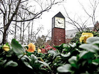
     This photo of Trombley is unique in the sense that there is an interesting perspective, good use of the 'rule of thirds' in that the clock and and horizontal break of the photo are at approximate 1:3 ratios in their given placements.  There is good apparent texture in the photo which I love because it adds to the 'feeling' that you are in the flowers looking beyond.  This may be an insignificant fact, but that the time is almost 3:00 makes me feel this slight anticipation in time, gives the photo more life than it would have been if it were closer to an exact hour.  The fact that the sky was gray and the colors of both the trees and library roof in the background, as well as the black top of the clock, and the plants and flowers are the only thing that are really 'colored' in this photo give it a weird illusion of a black and white photo, that was color edited to include the colors of the vegetation.  It is kind of an interesting juxtaposition of elements because the trees are obviously dormant, in winter mode, and the weather also suggests that, but the flowers are still in bloom.  Without knowing that the school plants these flowers and they aren't just growing on their own in the middle of winter, this photo is thought provoking.
      There are a few things that I think could have been altered in order to make the photo composition stronger.  I would have actually liked if the focus of the photo was on the flowers rather than the clock itself.  It is completely a personal preference, taking to the plants more than to the brick clock that I see everyday.  It would have shown how much focus isn't put on something that is also always in our path.  I feel like if the clock and background were blurred we'd still be able to know where the photo was taken, and a bit of mystery would have been added to the image, not knowing the time and possibly not having the library roof so apparent.  Which brings me to my next point, that even if it may have been impossible to get the library roof out of the shot, I feel like a photo without it present would have been better because it takes away from the subject.
     Great shot!

xo